
Real-Estate Platform Redesign: The Strategy That Increased Conversions by 62%
Redesigning a real-estate platform goes far beyond updating visuals—it requires understanding how users search for homes, compare options, and request information. In this case study, we break down the redesign approach that led to a 62% increase in conversions, outlining the decisions and improvements that delivered measurable results.
1. Starting With User Behavior
Before any design decisions were made, we analyzed user behavior across the original platform. Findings showed high drop-off rates during search and inquiry steps, unclear navigation, and long forms that discouraged potential buyers. These insights guided our priorities and ensured each update addressed real user friction.
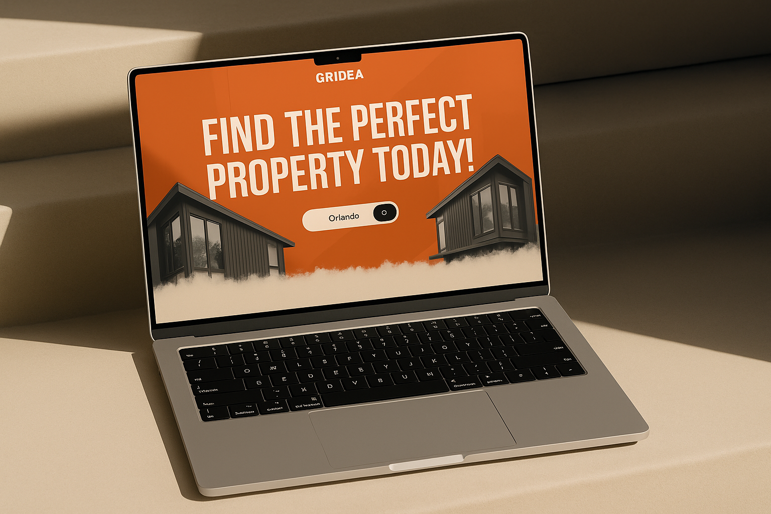
2. Fixing Navigation and Search Experience
Before any design decisions were made, we analyzed user behavior across the original platform. Findings showed high drop-off rates during search and inquiry steps, unclear navigation, and long forms that discouraged potential buyers. These insights guided our priorities and ensured each update addressed real user friction.
3. Redesigning Property Pages for Clarity
Property pages were rebuilt to highlight the information users care about most. High-quality images, key details (price, location, size), and a prominent call-to-action were placed above the fold. Cleaner layouts and improved spacing helped users quickly understand each property and take action with confidence.
4. Improving Calls to Action
Weak, low-visibility CTAs were replaced with bold, high-contrast buttons clearly labeled with actions like “Schedule a Viewing” or “Request Info.” CTAs were positioned strategically throughout the user journey, helping guide visitors toward their next step without overwhelming them.
5. Reducing Form Abandonment
Forms were one of the biggest causes of user drop-off. To fix this, we shortened form fields, introduced a multi-step format, removed unnecessary questions, and added progress indicators. These UX improvements reduced friction and significantly increased completed inquiries.
6. Strengthening Trust With Updated Visual Identity
Outdated branding contributed to user hesitation. The redesign introduced a more modern, trustworthy visual identity, including a fresh color palette, consistent typography, and added trust elements near CTAs and forms. These changes helped users feel more comfortable engaging with the platform.
7. Enhancing Speed and Mobile Performance
Technical optimization was critical, particularly as mobile users represented the majority of traffic. We improved image loading, streamlined scripts, and ensured responsiveness across all breakpoints. Faster load times resulted in better engagement and higher conversion rates.
8. Results After the Redesign
The combination of UX, UI, and performance improvements led to a 62% increase in conversions. Users were spending more time on property pages, completing more forms, and navigating the platform with ease. Mobile conversions saw especially strong gains, highlighting the impact of performance-focused improvements.
The redesigned platform ultimately delivered a smoother, faster, and more intuitive experience—showing that thoughtful design rooted in user behavior can directly elevate business performance in the real-estate market.
Related posts


Ready to build a smarter digital experience?
Reach out to Iongenix through our Contact Page and let’s begin.
© 2025 Iongenix LLC. All rights reserved.